
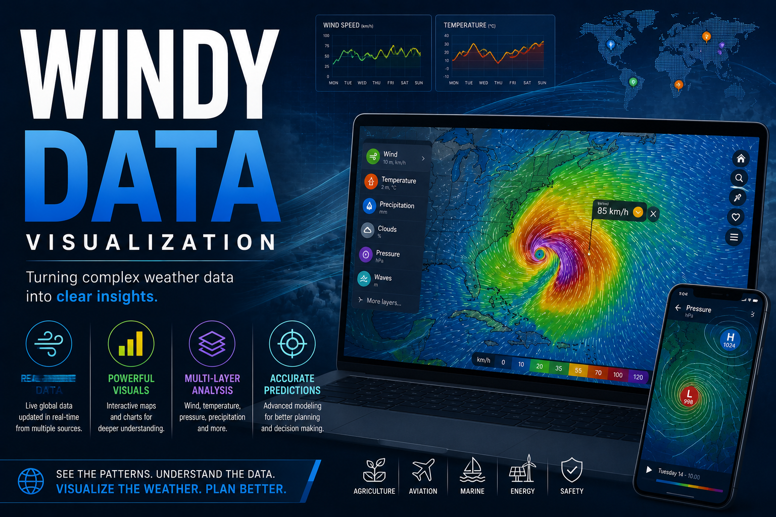
💡 Windy Data Visualization
A comprehensive strategic analysis of Windy's data visualization technology and its impact on global meteorological intelligence and industry decision-making.
Executive Summary
Windy, formerly known as Windyty, has transitioned from a niche tool for extreme sports enthusiasts into a global standard for meteorological data visualization. This analysis examines how Windy leverages high-performance computing to render complex atmospheric models into accessible, real-time visual intelligence. Key findings include the platform's integration of the European Centre for Medium-Range Weather Forecasts (ECMWF) HRES model, which offers a 9-kilometer resolution, and the Global Forecast System (GFS) from NOAA. By providing over 40 distinct weather layers, Windy has become an essential asset for maritime, aviation, and renewable energy sectors. The strategic value of this data visualization lies in its ability to reduce cognitive load for decision-makers, allowing for faster response times during volatile environmental conditions. Statistics indicate that the ECMWF model, a cornerstone of Windy's offering, consistently ranks as the most accurate global forecast model with a significantly lower root-mean-square error compared to its peers.
Introduction
The ability to visualize invisible atmospheric forces has historically been a challenge reserved for government agencies and academic institutions. Windy has disrupted this landscape by democratizing access to professional-grade meteorological data. In a global economy where weather-related disruptions can cost industries billions of dollars annually, the demand for precise, visual-first data platforms has reached an all-time high. This article examines the technological infrastructure of Windy, the strategic implications of its data modeling, and how it serves as a critical node in the broader ecosystem of digital intelligence. Just as the banking sector strategic analysis highlights the necessity of risk mitigation through data, Windy provides the tools necessary for physical risk management in the face of climate volatility.
The Deep Dive: Technical Infrastructure and Data Modeling
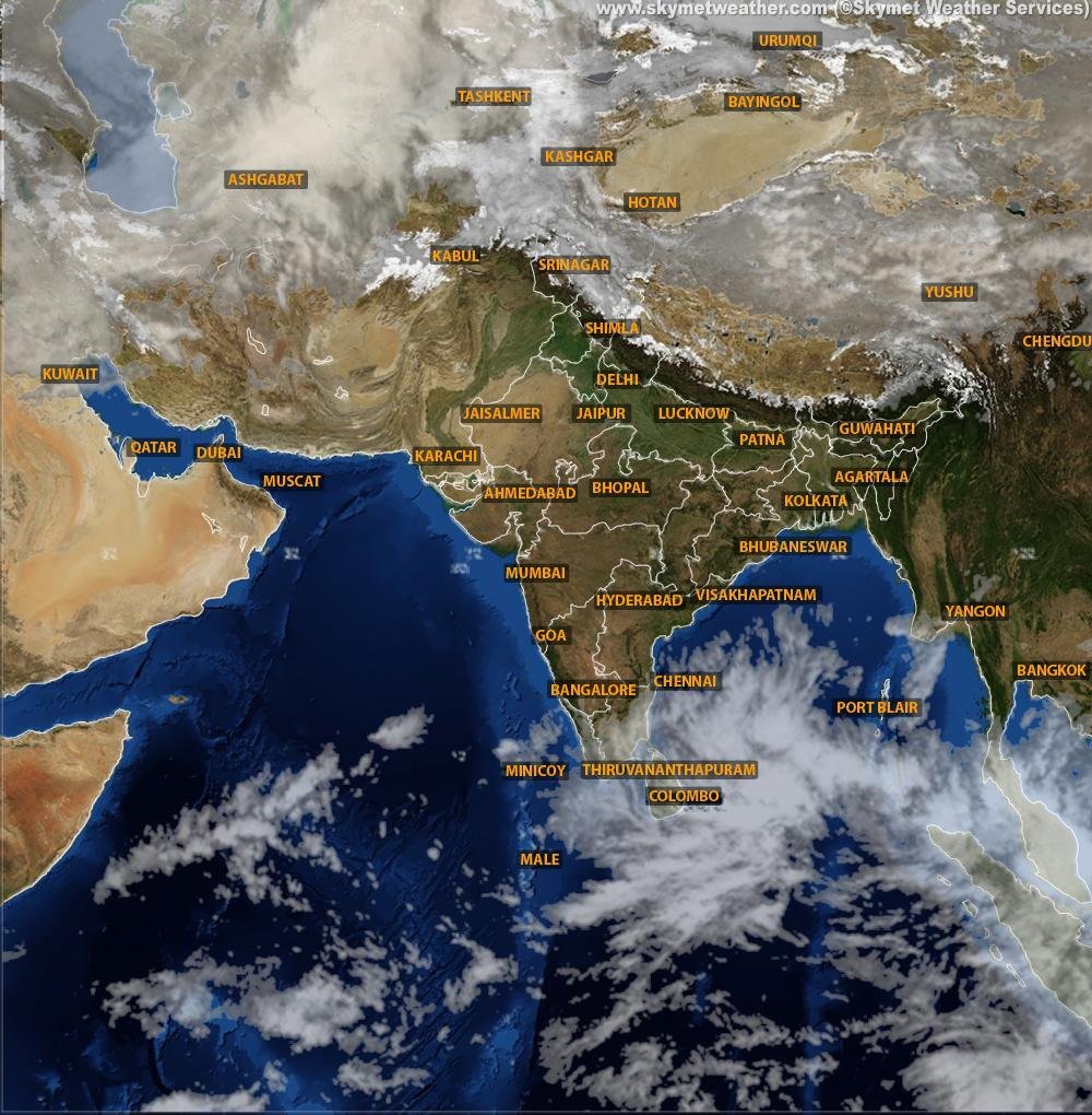
Windy operates by aggregating data from the world's leading meteorological organizations and processing it through a proprietary WebGL-based rendering engine. This technology allows for the fluid, high-frame-rate animation of wind particles, pressure gradients, and precipitation levels directly in a web browser or mobile application. The platform does not create its own weather forecasts; rather, it acts as a sophisticated visualization layer for existing models.
The Battle of the Models: ECMWF vs GFS
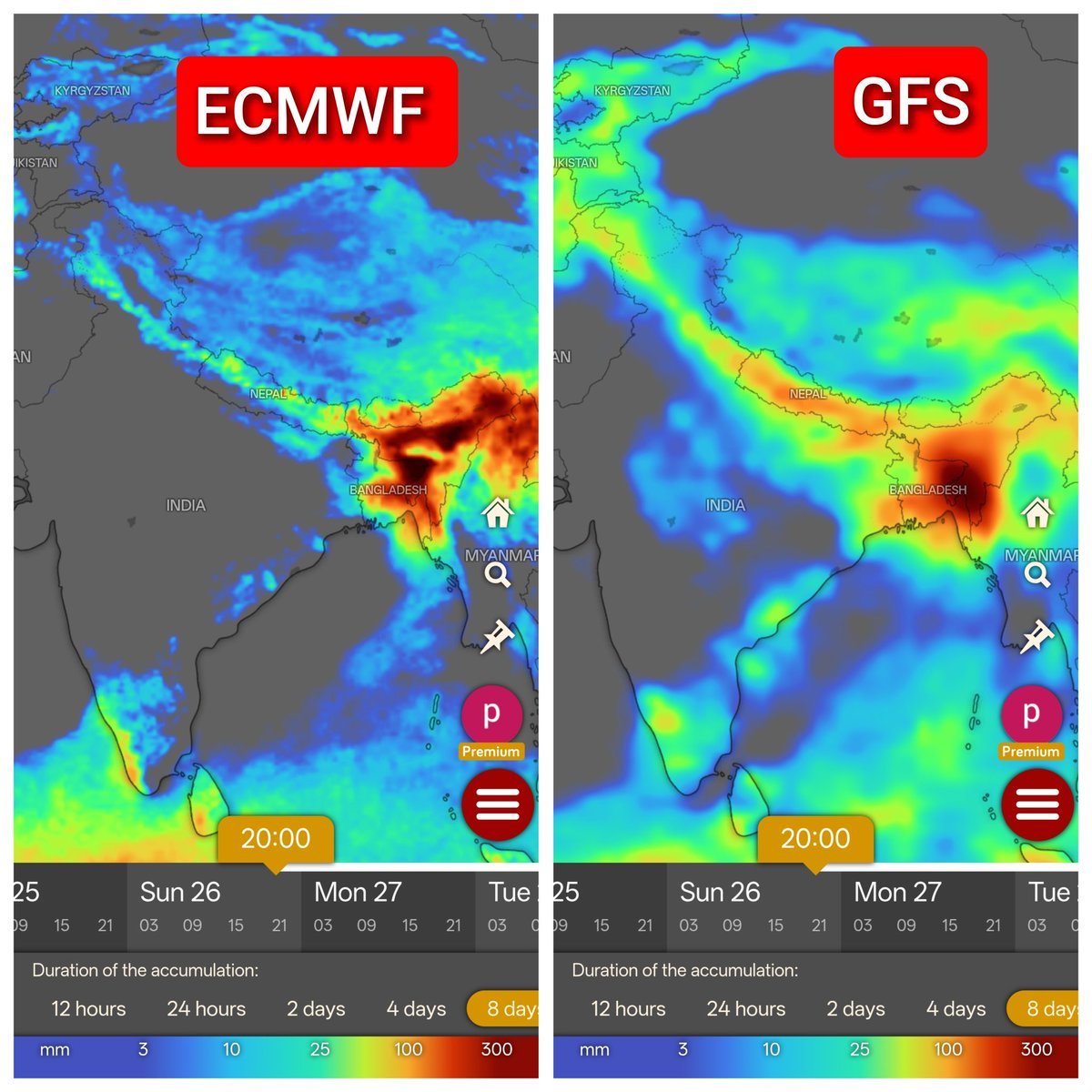
The core of Windy's authority stems from its inclusion of the ECMWF model. While the GFS model is free and widely used, the ECMWF is a paid subscription model that is generally considered the gold standard in meteorology. The ECMWF HRES (High Resolution) model provides a 9km grid, whereas the GFS provides a 13km grid. This difference in resolution is critical for predicting localized weather phenomena and storm tracks. In many instances, the ECMWF has correctly predicted the path of major hurricanes days before other models, providing a strategic advantage for emergency services and logistics companies.
Vertical Industry Applications
The utility of Windy extends far beyond casual weather checking. Several key industries rely on its visualization for daily operations:
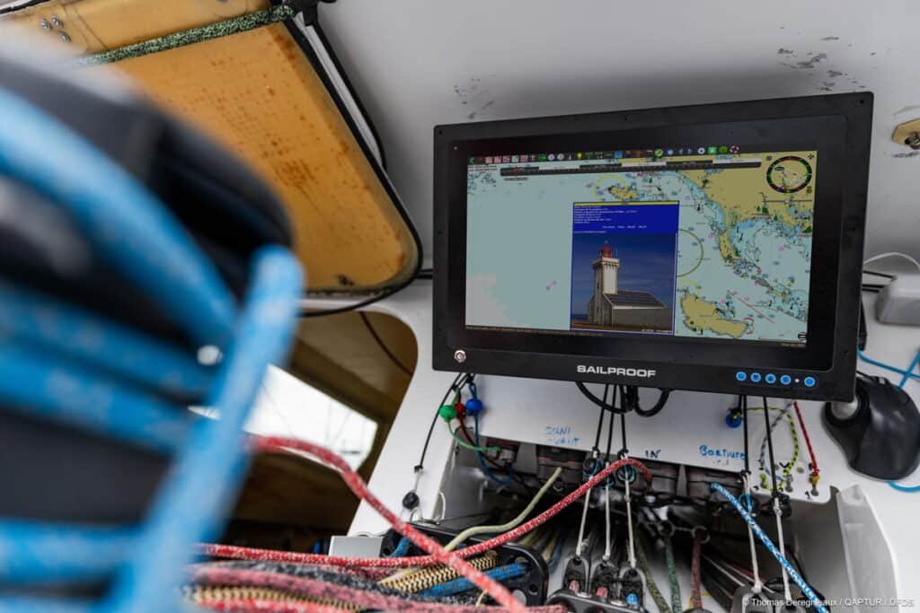
- Maritime and Shipping: Captains use the swell and current layers to optimize routes, reducing fuel consumption and ensuring crew safety. The integration of AIS (Automatic Identification System) data allows for real-time tracking of vessels against weather patterns.
- Aviation: Pilots utilize the cloud base, visibility, and CAPE index (Convective Available Potential Energy) layers to plan flight paths and avoid turbulence. This level of detail is comparable to professional flight planning software.
- Renewable Energy: Wind farm operators analyze wind speed at different altitudes (10m to 13.5km) to predict energy output and schedule maintenance during low-wind windows.
Effective communication of this data often occurs through integrated platforms, similar to how Google Meet and collaboration tools facilitate professional coordination during environmental crises. For media professionals like Cecily Tynan, the ability to translate complex meteorological data into digestible visual information is a core competency that Windy enhances.
User Interface and Cognitive Load
The strategic brilliance of Windy lies in its User Interface (UI). By using color scales that are scientifically calibrated (such as the Beaufort scale for wind), the platform allows users to assess a situation at a glance. The use of particle animation to represent wind flow is not merely aesthetic; it leverages the human brain's ability to recognize patterns in motion. This reduces the time required to interpret a traditional synoptic chart, which requires specialized training to read. Windy bridges the gap between raw data and actionable intelligence.
Global Reach and Community Integration
Windy has fostered a robust community of weather station owners who contribute real-time data back into the platform. With over 30,000 active weather stations reporting via the Windy Personal Weather Station (PWS) network, the platform achieves a level of ground-truth verification that satellite data alone cannot provide. This crowdsourced data layer adds a unique level of reliability to the visualizations, particularly in remote areas where official government stations may be sparse.
What This Means For You
For the average reader or professional, Windy represents a shift toward data transparency. You no longer need to rely on a simplified weather report from a local news station. Instead, you can view the same models used by professional meteorologists. If you are involved in logistics, outdoor event planning, or travel, understanding how to toggle between the ECMWF and GFS models can provide a more nuanced view of potential risks. Actionable steps include:
- Compare Models: Always check both the ECMWF and GFS models. If they align, confidence in the forecast is high. If they diverge, prepare for uncertainty.
- Use the Meteogram: The meteogram feature provides a 10-day look at pressure, temperature, and precipitation in a single chart, making it ideal for long-term planning.
- Check the Satellite Layer: For immediate weather changes, the real-time satellite and radar layers are more accurate than any predictive model.
Expert Verdict / Future Outlook
The future of Windy lies in the integration of Artificial Intelligence and Machine Learning. As AI-driven weather models like GraphCast (developed by Google DeepMind) begin to outperform traditional numerical weather prediction (NWP) models in speed and accuracy, Windy is likely to incorporate these layers. We expect to see a transition toward hyper-local forecasting, where resolution drops below the 1km mark, allowing for street-level weather visualization. The strategic value of Windy will continue to grow as climate volatility increases, making high-fidelity weather data a prerequisite for global economic stability.
FAQ
Is Windy's data more accurate than a standard weather app?
Windy is not necessarily more accurate in its raw data, but it is more comprehensive. It allows users to view the ECMWF model, which is statistically the most accurate global model, whereas many free apps only use the GFS model.
What is the difference between the blue and red colors on the wind map?
The color scale typically represents wind speed. Blue and green indicate light to moderate winds, while orange, red, and purple indicate high-velocity winds and potential storm conditions.
How often is the data updated?
The ECMWF model updates twice a day, while the GFS model updates four times a day. Windy refreshes its visualization as soon as the new data packets are released by the respective agencies.
Can Windy be used for flight planning?
While many pilots use Windy as a supplemental tool for situational awareness, official flight planning must still rely on certified aviation weather services (like METARs and TAFs) provided by national authorities.
Is there a cost to use Windy?
Windy offers a free version with extensive features. A premium subscription is available for users who require 1-hour forecast increments, faster update cycles, and more detailed satellite archives.
Conclusion
Windy has redefined the standard for environmental data visualization. By combining high-resolution meteorological models with a powerful rendering engine, it provides a level of clarity that was previously unavailable to the public. For industries ranging from maritime logistics to renewable energy, Windy is not just a weather app; it is a strategic tool for risk management and operational efficiency. As data sources become more complex, the ability to visualize that data clearly will remain the primary differentiator for successful decision-making in an increasingly unpredictable world.





Comments 0
Leave a Reply
Your email address will not be published. Required fields are marked *
Be the first to share your thoughts!